Websites · Brand · 2026
Knock Em' Down Detailing
Off a Squarespace template and onto a new site, a new mark, and the system the business runs on.
 Live build
Jacob details cars where they sit, mostly around St. Louis, including for a Porsche dealership. The site he had was a Squarespace template that never got finished. The page title still said "Your Site Title". The store sold nothing. The copy read like it came out of a chatbot, because it had.
The problem was not that it looked bad. It was that none of the good stuff was on it. He shoots a foam cannon over a G-Wagon at a stone estate at dusk and none of that footage was anywhere. He has twenty-five five-star reviews and the page showed four testimonials that nobody had written. He details boats, which is in his registered business name, and the site had never mentioned it.
So the rebuild was mostly about getting real material in front of people. The hero is his own 4K footage. The reviews are his actual ones, with names, linked back to where they live. The type is a condensed grotesque that can carry the brand at poster scale, and because the business is called Knock Em Down, the wordmark gets knocked over as you scroll past it.
Built in Astro and hosted for nothing. Every URL the old site published still resolves, so the posts he already ranks for did not go dark. He can add merch and write posts himself through a visual editor that commits to the repo, so nothing routine needs me.
Since then it has become the system he runs the business on. Quotes and booking happen on the site. Behind it sit customers, invoices, the books, inventory and follow-ups, with an iPhone app that does all of it from the driveway. It was built to replace Housecall Pro and QuickBooks.
The mark
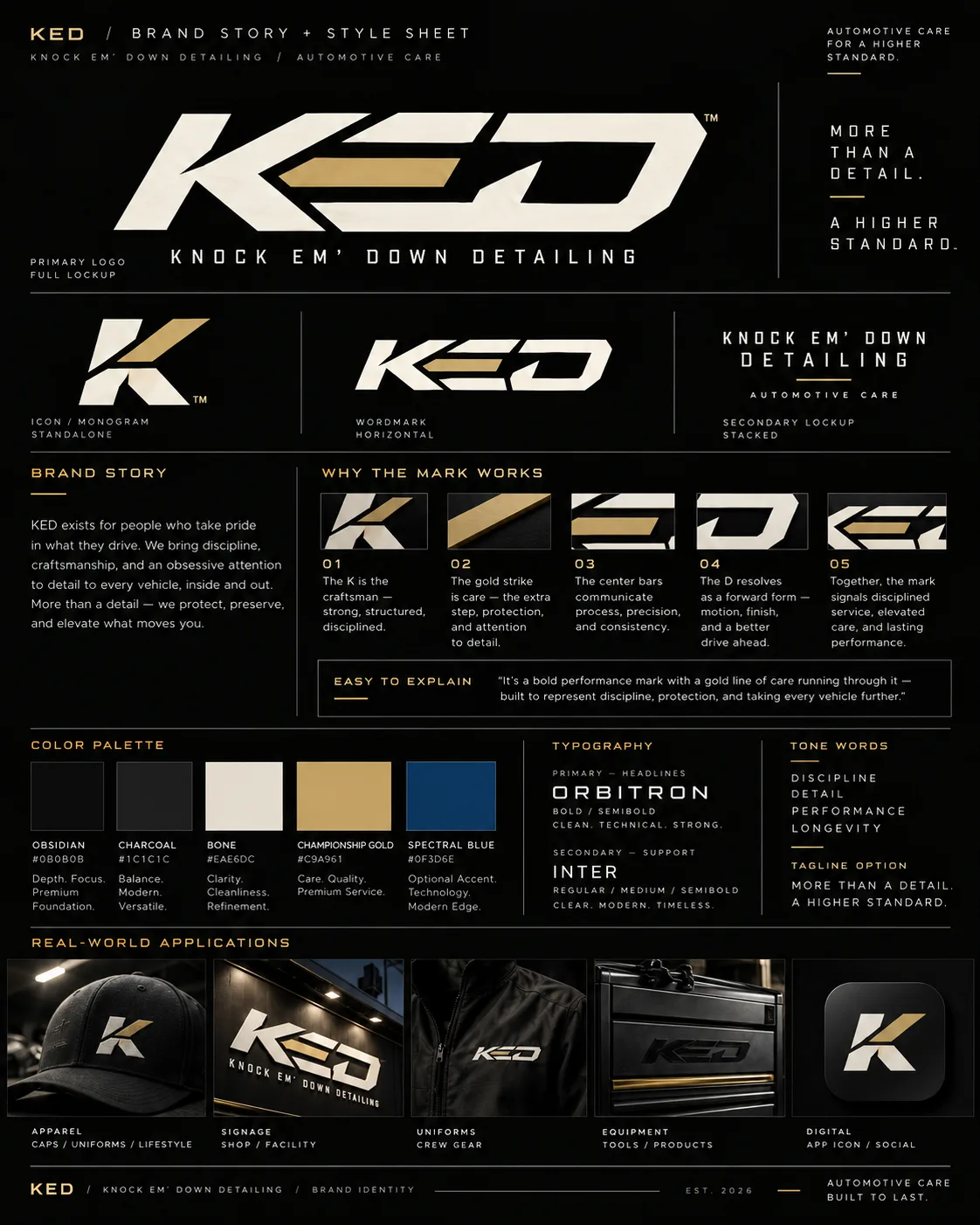
The old logo was a car outline over two lines of words. It could not survive being shrunk to a favicon or stitched on a hat. The new one is KED in a single hard italic, with one gold bar running through the middle. The K stands on its own for the small places: the app icon, the favicon, a door-jamb sticker.
The approved concept was a flat image with no vector behind it, so I redrew every shape by hand as points. One script holds those points and writes the whole kit from them: each mark in every color as SVG and PNG, the app icon, the favicon, the email logo. The site, the invoices, the iPhone app and the stickers all moved to the new gold the same night.
 Wordmark
 Monogram
 App icon
- Ink#07080A
- Bone#EAE6DC
- Gold#C9A961
Running here while the domain moves across. It will live at kedservice.com.
← All websites